.png)

TL;DR:
- A marketing dashboard consolidates real-time performance data from multiple channels into a single visual tool, enabling faster, data-driven decisions for SMBs. Designing role-specific, limited, and actionable views ensures higher adoption and better decision-making, while regular audits and automated data sources maintain trust and relevance. The key to success lies in aligning metrics with decision needs, avoiding vanity metrics, and continuously updating the dashboard to reflect changing priorities.
A marketing dashboard is a centralised, real-time interface that consolidates your key performance indicators from channels like Google Ads, Meta, your CRM, and web analytics into a single visual display to guide faster, smarter decisions. For small and medium-sized business owners and marketing managers, it is the difference between reacting to last week’s data and acting on what is happening right now. If you are still pulling numbers from five separate platforms into a spreadsheet every Monday morning, you are not just wasting time. You are making decisions with a blindfold on. This guide covers why build a marketing dashboard, how to design one that actually gets used, and which metrics belong inside it.
What are the primary benefits of building a marketing dashboard?
The most immediate benefit is time. Manual reporting time can be reduced by up to 80% per quarter when structured, real-time dashboards replace spreadsheet-based reporting. That is not a marginal efficiency gain. It is the equivalent of reclaiming weeks of strategic thinking time every year.
Beyond speed, here is what a well-built dashboard delivers for SMB marketing teams:
- Reduced cognitive load. Limiting your view to the metrics that drive decisions prevents the paralysis that comes from staring at 40 rows of data with no clear next step.
- A single source of truth. Dashboards align marketing, sales, and finance teams around the same numbers, shifting conversations from “whose data is right?” to “what do we do next?”
- Real-time campaign control. Live dashboards allow you to pause underperforming campaigns immediately rather than discovering the problem in a weekly report.
- Stronger budget justification. Connecting campaign activity to revenue outcomes means you can defend your ad spend with data rather than gut feel, and avoid repeating low-impact efforts.
- Improved ROI through sharper allocation. When you can see which channels are generating pipeline and which are burning budget, reallocation becomes obvious rather than political.
For a deeper look at tracking marketing metrics as an SMB, the principles here apply directly to what you put on your dashboard.
Pro Tip: Before you build anything, write down the three decisions your dashboard needs to support each week. If a metric does not inform at least one of those decisions, leave it out.

How to design an effective marketing dashboard that drives decisions
Design is where most dashboards fail. Marketers load them with every available metric, add colourful charts, and then wonder why nobody opens them after the first week. Good design is about restraint, not decoration.
Follow this sequence when building your dashboard layout:
- Apply the three-question test to every KPI. Ask: Does this metric tell me what happened? Does it tell me why? Does it tell me what to do next? If a metric cannot answer at least two of those questions, it does not belong on the dashboard. This approach reduces dashboard clutter by at least 30% without losing any decision power.
- Limit metrics per view to 8 to 12. Cognitive overload sets in beyond 12 metrics, leading to analysis paralysis. Fewer, better metrics outperform comprehensive but overwhelming displays every time.
- Build role-specific views. Executives need high-level summaries: total pipeline, blended ROAS, cost per acquisition. Campaign managers need granular KPIs: ad set CTR, landing page conversion rate, cost per click by audience. Mixing these audiences on a single dashboard causes disengagement from both groups.
- Add decision thresholds to operational KPIs. A metric without a trigger is just a number. Set clear intervention points, for example: CTR below 1% triggers a creative review, CPA above £60 triggers a bid strategy change.
- Include contextual comparisons. Raw numbers mean little without context. Directional indicators such as arrows, colour coding, and prior period comparisons help your team interpret performance at a glance.
- Place filters at the top. Date range, channel, and campaign filters should be the first thing a user sees. This makes the dashboard flexible without requiring separate builds for every scenario.
- Prioritise clarity over visual complexity. A clean table with clear labels outperforms a 3D pie chart every time.
Here is a quick comparison of dashboard approaches to illustrate the difference:
| Approach | What it looks like | Outcome |
|---|---|---|
| Metric overload | 30+ KPIs, mixed audiences, no thresholds | Ignored within two weeks |
| Role-based, curated | 8 to 12 KPIs per view, clear triggers, contextual comparisons | Used daily, drives decisions |
| Vanity-metric heavy | Impressions, likes, follower counts as primary metrics | Looks good, changes nothing |
Pro Tip: Build your executive dashboard first. If the CEO can answer “how is marketing performing this month?” in under 60 seconds, your design is working.
Which key metrics should you include in your marketing dashboard?
The metrics you choose define the quality of your decisions. The distinction between leading and lagging indicators matters here. Lagging indicators like revenue and total conversions tell you what already happened. Leading indicators like CTR, landing page conversion rate, and pipeline velocity tell you what is likely to happen next. A strong dashboard carries both.
Organise your metrics across three tiers:
Strategic tier (for leadership and budget decisions):
- Cost per acquisition (CPA)
- Return on ad spend (ROAS)
- Pipeline contribution by channel
- Marketing-sourced revenue
Channel tier (for channel managers and agency partners):
- Click-through rate (CTR) by platform
- Cost per click (CPC) by campaign
- Conversion rate by traffic source
- Audience reach and frequency
Operational tier (for day-to-day campaign management):
- Ad set performance vs. target
- Landing page bounce rate
- Email open and click rates
- Budget pacing vs. spend
Metrics to remove immediately: total impressions without a conversion link, social media follower counts, and page views without session quality data. These are vanity metrics that consume dashboard space without informing a single decision. For context on how analytics drive ROI in practice, the relationship between metric selection and business outcomes is direct.
Each metric on your dashboard should have a defined target and a benchmark. Without those reference points, even a good metric becomes meaningless. If your CPA target is £45 and your current CPA is £52, you know exactly what conversation to have and what lever to pull.
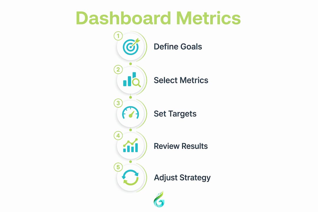
How to build and maintain your marketing dashboard effectively
Building the dashboard is the easy part. Keeping it trusted and used over time is where most teams struggle. Here is a practical workflow:
- Start with your business questions, not your data. Write down what decisions you need to make each week and each month. Then identify the metrics that inform those decisions. This prevents you from building a dashboard around whatever data is easiest to pull.
- Integrate reliable data sources. Connect your CRM (Salesforce, HubSpot), web analytics (Google Analytics 4), and ad platforms (Google Ads, Meta Ads Manager) through a reporting layer. Tools like Looker Studio, Supermetrics, or Databox handle this without custom development.
- Automate data refresh and anomaly alerts. Automating collection and refresh keeps the dashboard current and prevents the trust collapse that happens when someone spots stale data. Set up email or Slack alerts for significant metric deviations.
- Establish a governance model. Standardised KPI definitions across teams prevent the situation where marketing and finance are both reporting “conversion rate” but measuring completely different things.
- Schedule quarterly audits. Quarterly reviews remove metrics that no longer drive decisions and add new ones as business priorities shift. A dashboard that is not audited becomes a museum of old priorities.
- Align the dashboard with your meeting cadences. If your team reviews performance every Monday, the dashboard should be the first screen opened in that meeting. Adoption follows utility. If the dashboard answers the questions people are already asking, they will use it.
Pro Tip: Assign a single owner to each dashboard. Without ownership, nobody updates it, nobody audits it, and within three months it becomes a decorative PDF nobody opens.
For practical examples of how data-driven campaigns connect to measurable ROI, the same discipline that builds a good dashboard applies to campaign planning.
Key takeaways
A marketing dashboard works because it replaces scattered, manual reporting with a single, real-time view that connects campaign activity directly to business outcomes and drives faster decisions.
| Point | Details |
|---|---|
| Time savings are significant | Structured dashboards reduce manual reporting time by up to 80% per quarter, freeing resource for strategy. |
| Design determines adoption | Limit each view to 8 to 12 metrics with role-specific layouts to prevent overload and disengagement. |
| Metric selection defines quality | Separate leading and lagging indicators across strategic, channel, and operational tiers for clarity. |
| Governance sustains trust | Standardised definitions, automated refresh, and quarterly audits keep dashboards relevant and credible. |
| Alignment drives action | Dashboards that answer the questions raised in existing meetings get used consistently and drive real decisions. |
Our honest take on marketing dashboards for SMBs in 2026
The most common mistake we see at Geo Growth Media is not a technical one. It is an audience problem. A business owner builds one dashboard, loads it with every metric their agency or analyst suggested, and then shares it with the CEO, the campaign manager, and the social media executive simultaneously. Within a fortnight, nobody is looking at it. The CEO cannot find the revenue number. The campaign manager is drowning in summary charts. The social executive cannot see their platform data at all.
The fix is not a better tool. It is a clearer question: who is this dashboard for, and what decision does it need to support? Once you answer that, the metric list practically writes itself.
We have also seen SMBs fall into the trap of treating the dashboard as a finished product. It is not. Business priorities shift, campaigns change, new channels launch. A dashboard that is not revisited every quarter starts reflecting last year’s strategy, not this year’s goals. That is worse than no dashboard at all, because it gives false confidence.
The competitive advantage for SMBs in 2026 is not having the most sophisticated dashboard. It is having one that your team actually opens, trusts, and acts on. Automated data feeds, clear thresholds, and role-based views are not luxuries. They are the baseline for any dashboard worth building. If your current reporting setup cannot tell you by 9am on Monday whether last week’s campaigns were profitable, you are already behind.
— Geo Growth Media
Ready to build a dashboard that actually drives growth?
At Geo Growth Media, we work as an extension of your marketing team, which means we do not just run your campaigns. We make sure you can see exactly what they are delivering.
From integrating Google Ads, Meta, and your CRM into a single reporting view, to setting up automated performance alerts and role-based dashboards, we handle the setup so you can focus on the decisions. Our clients stop guessing and start acting on data that is current, clear, and connected to revenue. If you are ready to replace your Monday morning spreadsheet with something that actually works, explore our digital marketing services and see how we can help you build reporting that earns its place in every team meeting.
FAQ
What is a marketing dashboard?
A marketing dashboard is a centralised, real-time visual tool that consolidates key performance indicators from multiple channels, such as Google Ads, Meta, and your CRM, into a single interface to support faster marketing decisions.
How many metrics should a marketing dashboard include?
Optimal dashboards include 8 to 12 metrics per view to prevent cognitive overload. Exceeding this threshold leads to analysis paralysis and reduced dashboard adoption across teams.
Why use marketing analytics rather than just web analytics?
Web analytics tracks site behaviour, but marketing analytics connects campaign activity to revenue outcomes, enabling you to justify budgets, identify high-performing channels, and avoid repeating costly low-impact campaigns.
How often should you update or audit your marketing dashboard?
Quarterly audits are the recommended minimum to remove unused metrics, update targets, and realign the dashboard with current business priorities. Data refresh should be automated to run daily or in real time.
Do you need a different dashboard for executives and campaign managers?
Yes. Role-based dashboards significantly improve adoption because executives need high-level revenue summaries while campaign managers require granular, channel-level KPIs. Mixing both audiences on one view causes disengagement from both groups.
.png)